Moving Money, Reducing Friction —
HSA Custodial Transfer
Transforming a complex, paper-based financial transfer process into a clear, confidence-building digital experience — balancing security, legal, and operational constraints without compromising the user.
3K+
transfer requests per month routed through a paper-based PDF form
Manual
ops rework on every rejected or incomplete submission
Zero
visibility for members after submitting their request
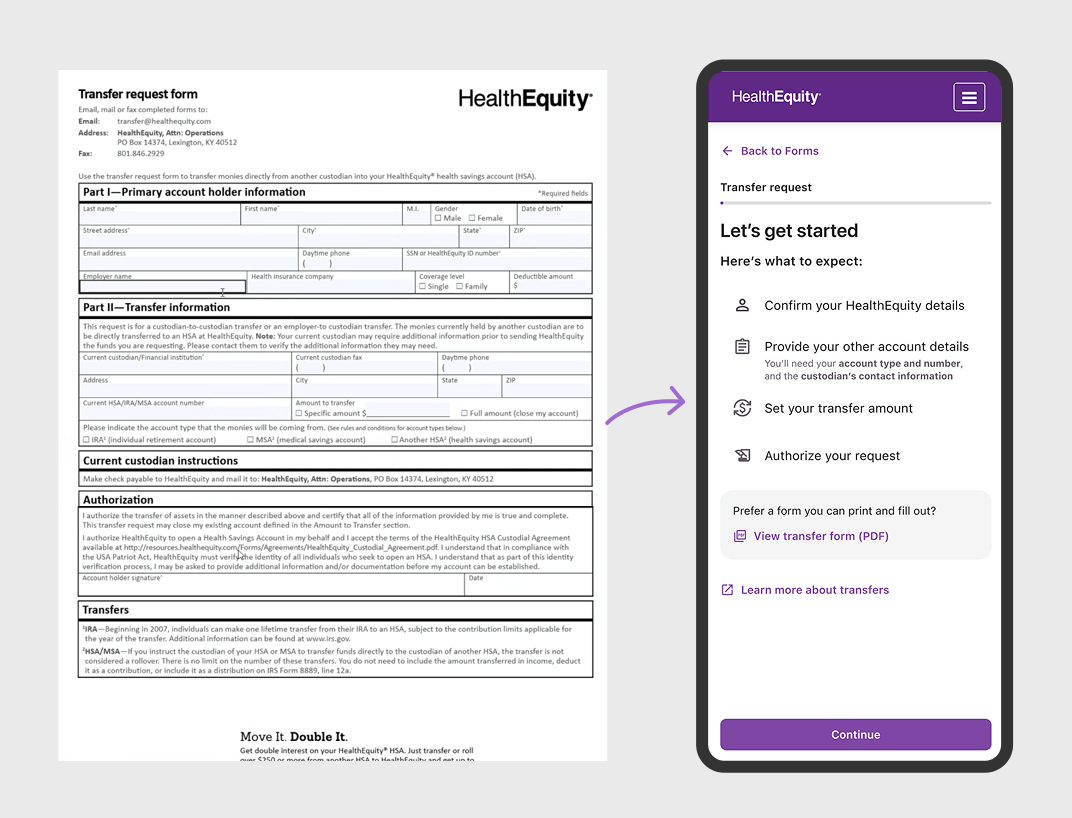
Work I Owned
End-to-end product design
UX Design
Research synthesis, information architecture, wireframes, and high-fidelity Figma prototypes across the full member flow.
Cross-team Collaboration
Partnered with compliance, member services, and the custodian ops team to align on constraints and validate design decisions.
Developer Handoff & Review
Authored detailed Figma specs and edge-case documentation, and participated in implementation review to ensure design fidelity.
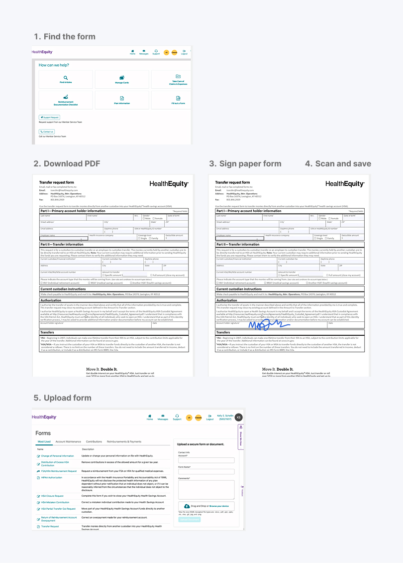
Download, print, sign — then hope for the best
Members downloaded, signed, and submitted a PDF outside the portal — creating friction and drop-off.
No visibility after submission
No confirmation, no status updates — members had no way to know if their transfer was progressing.
Confusing choices, costly mistakes
No guidance on partial vs. full transfers led to rejected submissions and fear of unintended closures.
One form, two very different users
Custodians and members had different goals and contexts — yet both navigated the same undifferentiated form with no tailored guidance.
HSA Transfer · Member Flow
Research
Studying what others got right
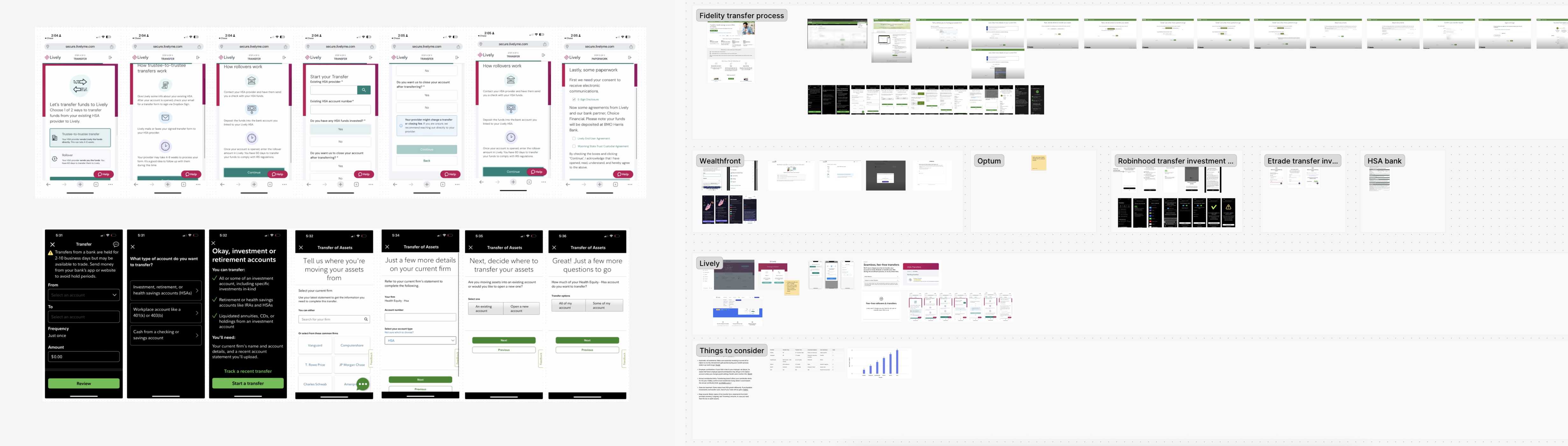
Before jumping into design, I audited how leading financial platforms — Fidelity, Vanguard, Betterment, and others — guide users through money movement flows. The goal: identify patterns that reduce anxiety, improve clarity, and set the right expectations.
Pattern 1
Best-in-class apps use a step indicator to set expectations upfront — members know exactly where they are and what's left before they commit.
Pattern 2
Leading platforms surface inline help and tooltips next to jargon-heavy fields, reducing calls to support and preventing incorrect form submissions.
Pattern 3
A clear review-and-confirm step before submission lets users catch errors early — critical when transferring retirement funds that can't be easily reversed.
Structure
One decision at a time —
a form reframed as a journey
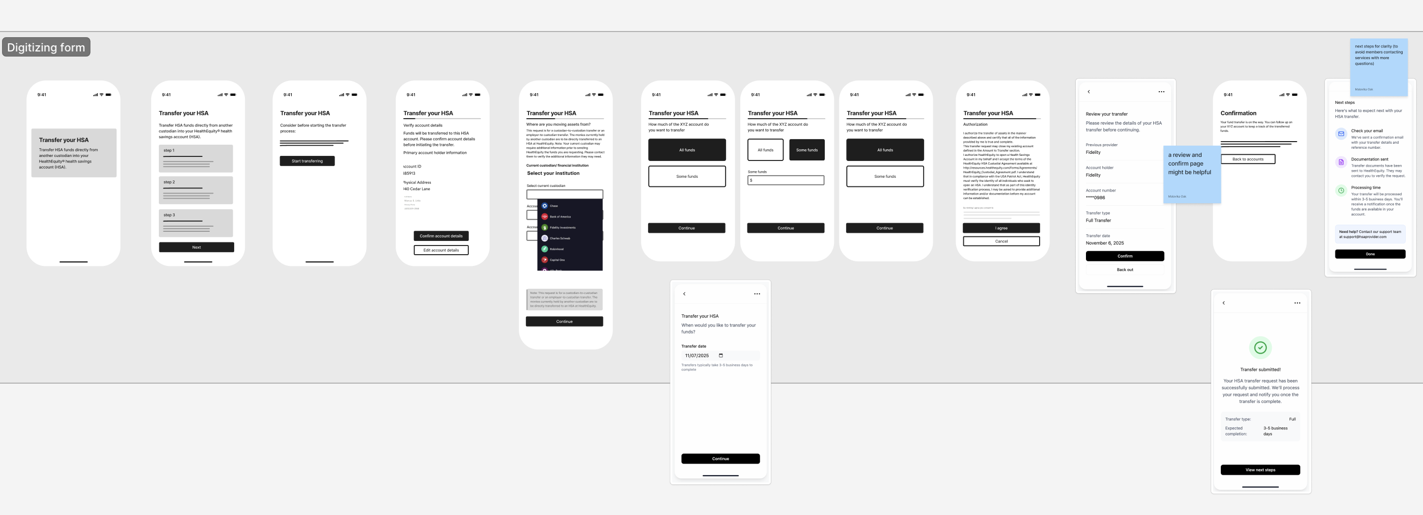
I worked closely with the product team to understand platform constraints and the specific pain points members called in about — incomplete submissions, confusion over partial vs. full transfers, and anxiety about irreversible actions. That grounding shaped the first structural decision: break the form into a clear, step-by-step flow.
Key discussions with product team
Before
PDF form, mailing or uploading required. Error prone and confusing process.
After
A progressive, multi-step flow with clear entry, checkpoint, and exit points — each decision contained and purposeful.
Clarity
Reducing cognitive load
& error risk
Design Principle
Educate members along the way. Surface the right information at the moment that's most relevant to the action.
Post-Submission
Clear next steps —
after the form was submitted
I designed the confirmation state to close the loop — reducing uncertainty for members and cutting down on calls to member services asking "did my transfer go through?"
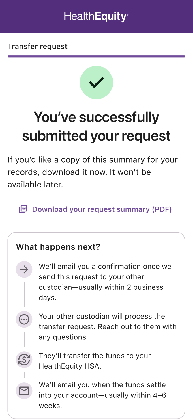
Instant confirmation
Members received an on-screen confirmation immediately after submitting — no ambiguity about whether the request went through.
What happens next
The screen outlined the next steps in plain language — what HealthEquity does, what the custodian does, and roughly how long each stage takes.
Where to track progress
Members were directed to their activity feed to monitor the transfer — turning a previously invisible process into a trackable one.
Design Challenge
Showing member details —
without exposing the SSN
The confirm details screen needed to surface enough information for members to verify their identity — but Security would not allow the SSN to be displayed. We went through several iterations before landing on a solution that satisfied compliance without breaking the experience.
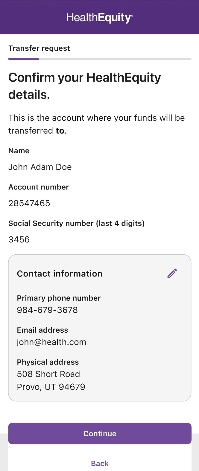
SSN displayed in full
Our starting point showed the full SSN for verification. Security flagged this immediately — it could not be rendered in the UI under any circumstance.
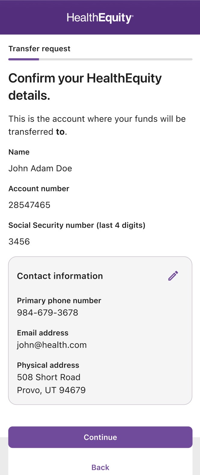
Partially masked SSN
We explored showing only the last four digits. Still not approved — any partial display of the SSN introduced compliance risk.
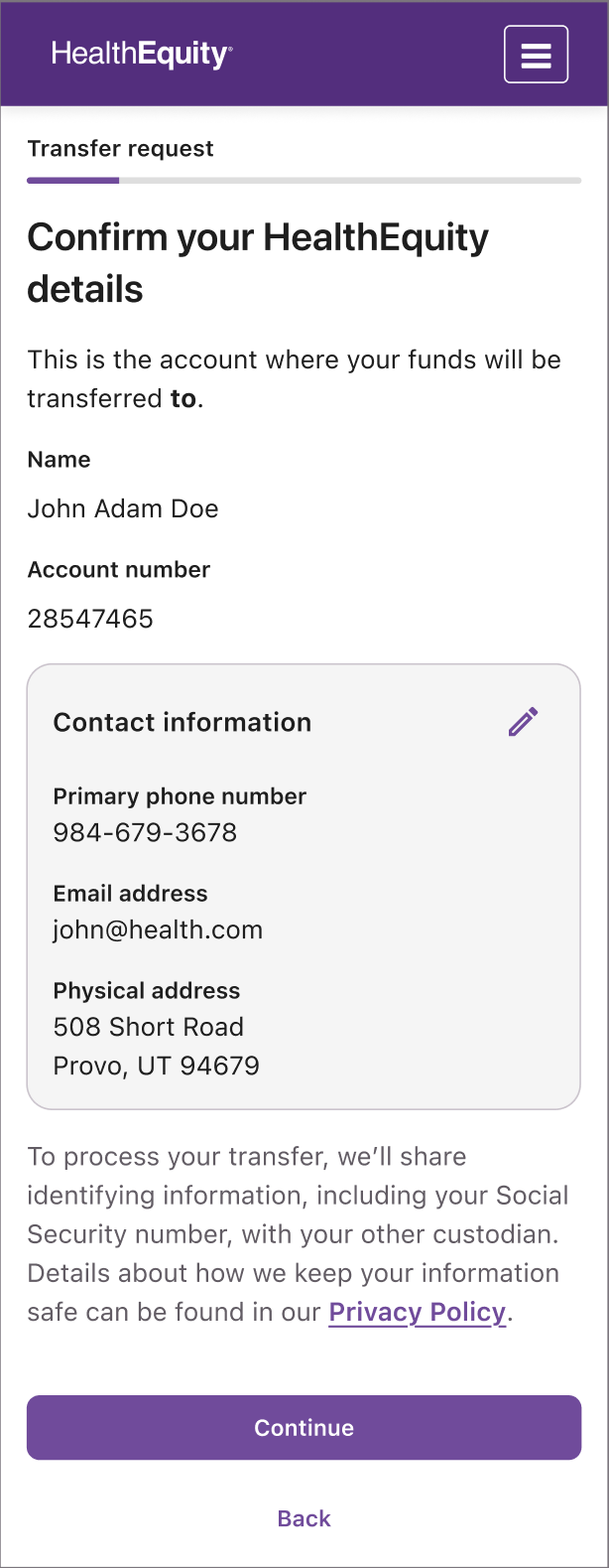
Attestation — no SSN shown
Members confirm the details already on file by checking a statement — no SSN is rendered at any point. Legal and Security signed off. The experience still feels like a meaningful verification moment.
Reflection
What I took away from
this project
Fintech UX is often described as a tension between compliance and user experience — as if the two are fundamentally in opposition. This project taught me that the best design work finds the path through, not around, real constraints.
Advocating for users doesn't mean ignoring security requirements. It means finding the design solution that satisfies both — and being willing to bring that solution through the stakeholder process, with evidence and patience. That's where the interesting work lives.
The experience of elevating a manual, error-prone task into a modern, scalable digital flow reinforced something I believe deeply: great design for complex products isn't about simplification for its own sake. It's about making complexity navigable — so people can do what they came to do, with confidence.